Saturday, March 22, 2008

Your team must post!

Thanks for those who have been posting and thanks for your hard work!

But please remember, by this point all teams must have their posts up on the blog: prototypes, designs, marketing materials, budgets etc. Please remember you need to post for your team work during the project, not after. Any items for marking consideration must have contributed to the design of this project.

Please note, you can use the Great Hall as of Monday 6pm to setup/build. I'll be around the event area on Monday from 10am-noon and Tuesday from noon until 2pm. So please come and find me if you have questions or need help with anything. Most likely I'll be in the Great Hall or the Design Faculty office, but maybe also in the auditorium or lobby etc. We need to set up the projection, get a sense of space, do a usability test on the game, fine tune things etc. I know we talked about Tuesday at noon, so see you then at the latest.

If the desing team need help, please post to the blog as soon as you can.

As for hanging stuff, there will be dividers we can use if necessary. Note we can't put double sided tape onto the Great Hall walls.

Here is the high res version of the logo as other one I had was low res...

Looking forward to working with and having fun with all of you. I'm checking email on a regular basis, so please let me know if you need anything.
Teresa

Tuesday, March 18, 2008

faculty meetng results

Hi there, I got us a great space and more info, but before you read on, please make sure to read the other posts below mine as they are important.

Space
Ok, the good news, I got us a corner in the auditorium for the space we wanted. The floor plan is at the bottom of this post.

Setup
The actual event is on Wednesday 26th from 2:30pm to 4:30pm. We can start setup as early as needed on Wednesday and will need to know which people are available to setup. We can figure this out in class tomorrow.

Projection
I reserved a projector for us and will bring it down on Wednesday. What other tech requirements do we need? I found out that if we book IT they can help us install equipment and software.

Logo
Here is the event's logo so we can put on our marketing materials as appropriate...

Design Team- Estimated Budget for costumes

2 Balls- $7
Elastic- $3
2 gloves- $3
40 yards of Velcro- $160 (although we may be able to get a discount due to the amount we are buying)
TOTAL- $173

Sunday, March 16, 2008

space, materials, marketing, setup

Materials
Please bring your coloured T-shirts to class, as requested by the documentation team :)

Also,
please bring your $15 for next class. If you have major money issues come talk to me so we can figure something out, but please note that any unused money will be equally divided and returned to all of you in the end. Please keep all your receipts too.

If you think we could use some dividers (can't be damaged or marked), the school can loan some white core-plast 4' x 8' panels which can be put together in various ways. Let me know. In plan-view, they look like a triangle with concave curved sides held together at the tips of the triangles with wood strips bolted together, which run from top to bottom vertically along the three apexes of the triangle. Also, there are pedestals (can't be damaged or marked), currently in the 5th floor student lounge area, made of mdf, pre-drilled/screwed together.

Marketing
The faculty has a logo coming our way soon, which the marketing team will be able to use.

Space
As for the display space, faculty is meeting this Tuesday night (Mar 18) to layout the 17 projects into the lobby, Great Hall and auditorium (and park if you wish, but will be more isolated from event). The other areas mentioned before have not been confirmed. I'll try to get as large a rectangular space as possible - hopefully as large as the conference room we were in last class.

Setup
We can use the Great Hall to set up or build as of 6 pm on Monday the 24th, as well as all day and evening of Tues the 25th. During these times we can start bringing in materials or make things in this space. I'll just have to know a bit ahead of time to arrange it for us. Also, there may be some available storage in rooms in 113, so let me know if your group needs storage.

Leader emails
Project Management: Jessica JN07FK@student.ocad.ca (class leader)
Design: Nina NZ07EM@student.ocad.ca
Documentation: Colan CN07JG@student.ocad.ca
Game Management: Katherine KD07RM@student.ocad.ca
Marketing: Devin DW07FB@student.ocad.ca
for an updated list of team members see: http://ocadexperiencedesign2.blogspot.com/2008/03/activate-project-instructor-notes.html

Teresa

Wednesday, March 12, 2008

team leaders

forgot to mention team leader for Marketing: DEVON

March 12 - Class brainstorming

Team Leaders
Design- Nina (Najla)
Game Management- Katherine
Documentation- Colan
Marketing-Devon

Game Specifications
-large game
-hoped for locations: Great Hall or Auditorium
-size of space: about the size of the class-room

2 Players
9 Brain Cells
2 Stimulants that rotate
2 balls attached by a string

Budget
-
each student will pay: $15
-total budget: $405

Documentation: video documentation of entire process and event
Management: budget, time management, communication
Marketing: promotion, press release
Game Management: decide how game is run, test run, making game run on the day

For Next Week
All groups: create budget and post to blog, bring $15, arrange meeting within your group
Design Team-
create costumes for 1 player, 1 cell and the ball
be ready to mass produce
Marketing-
marketing plan
Game Management-
solid idea of how game works

Friday, March 7, 2008

Important: Brainstorm first

Hi there, I just wanted to let you know your team should brainstorm before taking a stab at the revised scenario, budget and prototype. You need to get a better sense of the what's, how's, who's etc. When writing the scenario, try to imagine how it will feel if you were a visitor within the context of the whole activate event that contains 17 other projects from the other classes around you. Have fun!
Teresa

Thursday, March 6, 2008

So here's the scenario:

My brain cells are deteriorating at an incredible rate due to the lifestyle choices i've made. I need to feel better. I want to feel better. My only way to satisfy this void is to accquire more brain cells, capture them if you will. They don't always come willingly.


multi person game.
10-15 people (brain cells)
2 people (empty nogans)

try and grab as many brain cells(velcro padded shirts) using velcro ball (attached to cord)

word up.

troypynn

Wednesday, March 5, 2008

"Activate" Project: Instructor Notes:

Hi there, I'll be using this post to consolidate updated information on our project. Please check this post regularly as it will contain currently updated information throughout the entire project period.

You can get the project description (under "Projects"), scenario form (under "Exercises"), and scenario slideshow lesson (under "Slideshows") through the "Course Materials" link on the left side of this blog.


These links can also help:

Prototyping:
http://www.guuui.com/issues/03_05.php
http://www.deyalexander.com/resources/uxd/prototyping.html
http://inventors.about.com/od/prototypes/a/prototype.htm
http://www.guuui.com/issues/01_07.php

Budgets:
http://www.genv.net/en-us/do_it/event_planning/budget_template
http://www.builderau.com.au/strategy/projectmanagement/soa/Creating-your-project-budget-Where-to-begin-/0,339028292,320265341,00.htm
http://www.e-projectmanagers.com/joomla/index.php?option=com_content&task=view&id=14&Itemid=40

Teresa

______________
Posted Thur Mar 6:

If you were not here last class, please get in touch with one of the groups below to join them asap as you have to present the following next week: once the selected scenario is posted to the blog, you must refine it into a richer two-paragraph scenario, create a project budget outlining how much money it might take to create the entire project ($10-$25 per student), and create a 2D or 3D prototype of how you visualize the design to look and function. Please note the Design Team cannot accept further members as its already too big. There should be between 4-6 students per group, except the Game Management Team can't have more than 4.

If you get an email from someone who wants to join your team, please just make sure you don't have more than six people on your team. Katie and Jin, you shouldn't have more than four people as your group is tied in with the Designers team already. Chris, I sent you an email about putting you in the Design team, but actually they're too large, so the closest is Game Management which will work closely with the Design Team, so I've placed you there instead.

If you're on the Documentation Team you must bring a digital video camera to class next class.

Project Management:
Jessica JN07FK@student.ocad.ca (Studio Head - class leader)
Jan JM07JF@student.ocad.ca
Ronnie VR07HC@student.ocad.ca
Jonah JF07IH@student.ocad.ca

Design:
Najla (Nina NZ07EM@student.ocad.ca (team leader)
Allie AC07GI@student.ocad.ca
Amy AH07NK@student.ocad.ca
Bonnie BT05VL@student.ocad.ca
Sima SG07NE@student.ocad.ca
Jennie XZ07KJ@student.ocad.ca
Elahe ES07PV@student.ocad.ca

Documentation:
Colan CN07JG@student.ocad.ca (team leader)
Helena HJ07IO@student.ocad.ca
Troy TP07FR@student.ocad.ca
Kurt KL07VM@student.ocad.ca
Denys DK07YL@student.ocad.ca

Game Management:
Katherine KD07RM@student.ocad.ca (team leader)
Jin Weon JP07JJ@student.ocad.ca
Chris CT07PJ@student.ocad.ca
Xuan XN07LI@student.ocad.ca
Bhavna BB07OM@student.ocad.ca

Marketing:
Devin DW07FB@student.ocad.ca (team leader)
Andy AK07IA@student.ocad.ca
Candy HC07VP@student.ocad.ca
Kelvin KK07TL@student.ocad.ca
Kunnal KK07IP@student.ocad.ca
Yosep YK06SH@student.ocad.ca

_____________
Posted Wed Mar 5:

Location:
Faculty met yesterday night and decided "Activate" (the new name) will take place indoors at 100 McCaul. The available spaces will be the Great Hall, the lobby (to be confirmed), Lambert Lounge (to be confirmed), the auditorium, and connecting hallways (to be confirmed). There will be a faculty meeting to determine where the 17 classes will display their projects, but for now, please include in your refinements for next week where you envision it to be. You can also include a second and third choice.

Refinements:

All teams (regardless of their official role for later on) will brainstorm and present the following to the class next week:
1) revised scenario: broaden the scenario to be longer, more detailed and more realistic. Think about how the following can affect the scenario: the space it will be activated in, what users roles will be, the size and shape of the design, how the users will interact, tasks, actions, objects, environment etc.. Use the scenario form and project description to provoke further thought. Please see the blog's "Course Materials" link to download these documents. The form is under "Exercises" and the project description is under "Projects".
2) prototype: create a drawing or 3D model to show how the game could look. Consider the space it will be activated in, how the tasks, user role, actions, objects and environment will affect the way the design will look and function.
3) Budget: create a budget for the entire project based on 27 students contributing $10-$25 each.

Elahe Salehi - Inspirational Design- The Phone Tooth


Elahe Salehi

The Phone Tooth


The "Phone Tooth" is a wireless receiver that can be implanted into your tooth with the aid basic dental surgery. The implant can allow a person to receive digital signals from radios and mobile phones, from the privacy of their own head. The signals are translated into vibrations that travel from the tooth to your skull to your inner ear where only you can hear them. Designed by Jimmy Loizeau and James Auger, research associates from MIT Media Lab Europe. This new wireless receiver can be implanted into your tooth with the aid basic dental surgery. A micro-vibration device and a wireless receiver is implanted into a natural tooth during routine dental surgery. Sounds are transferred from the tooth into the inner ear by bone resonance (digital signals being converted into audio). Sound reception is assured to be totally discreet, so it will not make a buzzing sound in your mouth. The vibrations are on a molecular level, so the user only experiences pure sound streaming into their consciousness. The implant is designed to work in tandem with either a dedicated device or a modified mobile telephone, which can pick up the long distance signals and transmit a local signal to the tooth receiver. Capable of being fully customized to suit user requirements, reception can be switched on and off at will with the aid of the dedicated device. Having unwanted sound information arriving directly into the user's brain would resemble technological schizophrenia, therefore maximum control is essential
With the minimal hardware required, estimated costs of the implant are quite low and because the dental surgery is pretty basic, the procedure is relatively cheap. With health issues being minimal, about the same as the issues raised by the use of mobile phones, the tooth is expected to be available in markets in the near future.

I believe that as new technologies are often overly complex for their intended target audience, this interactive design The “Phone Tooth” aims to minimize the learning curve and increases accuracy and efficiency of it’s purpose as a digital receiver without diminishing usefulness. The objective of the Phone Tooth is to reduce frustration and increase user productivity and satisfaction. What attracted me the most was the use of biotechnology being imbedded with in our bodies used as the interactive object itself. This design crosses the border of the use of new sciences and technologies to enhance human mental and physical abilities and aptitudes. The Phone Tooth allows our bodies to become the interactive design experience within its biotechnological standards.

Trustworthy
The Phone Tooth is a good interaction design and that creates an enjoyable and fluid experience and is trustworthy because it is designed by Jimmy Loizeau and James Auger, research associates from MIT Media Lab Europe. MIT is known to be one of the most prestige Universities. However The Phone Tooth design raises some real issues about how far we want to go with using biotechnology in our bodies, but after research with health issues being minimal it’s about the same as the issues raised by the use of mobile phones. The implantation of this device in your tooth is an aid basic dental surgery, by your trusted dentist. This interactive design can be applied to the development of all solutions, which goes beyond the use of just cell phones and becomes apart of our being.


Appropriate
This interactive design is appropriate to the situation, context, and culture of its audience. The Phone Tooth is a futuristic universal design which applies to all individuals and will never diminish its uniqueness. The designers have gained the ability to better understand user goals and experiences. With this interactive design the user is aware of system capabilities from an early stage so that expectations regarding functionality are both realistic and properly understood. Also the user of this universal design feels a sense of ownership, thus increasing overall satisfaction.

Smart
This design is smart enough to do things for us that we can’t easily do alone, and to prevent us from making unnecessary mistakes or from working harder than we need to; responsive, showing us that it hears our every action; and clever, predicting the needs of your audience and then fulfilling those needs in unexpectedly pleasing ways.

Responsive
This interactive is an immediate and and quick responsive product that can allow a person to receive digital signals from radios and mobile phones, from the privacy of their own head. It is an experience that is developed highly across all dimensions of immediacy and consistently a product that satisfies its users. It’s responsive and offering to its group’s or individual's needs and desires.


5)
If I could be involved within the process of this great interactive design of The Phone Tooth I would attempt to improve the usability and experience of the product, by first researching and understanding certain users' needs and then designing to meet and exceed them. Figuring out who needs to use it, and how those people would like to use it. I want to take part in this process of multiple rounds of brainstorming, discussion, and refinement, drawing on a combination of user research, technological possibilities, and business opportunities. My objective is to help designers realize user requirements, after brainstorming and researching from these personae, and the patterns of behavior observed in the research, my goal is to create scenarios, which imagine a future work flow the users will go through using the product or service. After thorough analysis using various tools and models, my aim is to create a high level summary spanning across all levels of user requirements. This includes a vision statement regarding the current and future goals of a project.

Credits:http://www.time.com/time/2002/inventions/tra_phone.html

originally published: 3/12/08 9:04: Time modified by instructor to relocate posting below Activate Project postings.

Philips Ambient Window


I chose the Philips Ambient Window as my Inspiring Interaction Design. My expression upon first encountering this video of how the window functions was very similar to the woman in video 1. I was truly amazed at how technology has progressed within the last few years and the diverse ways in which it is being put to use.  This new concept of interactive lighting from Philips plays with natural sunlight and strength and combines it with patterns and a color grid,  allowing individuals to customize, create and control the atmosphere in the room they are in. The concept also addresses the seven “good interaction design characteristics”.


Trustworthy-  The product is immediately considered trustworthy due to its association with Phillips, one of the worlds leading electronics companies, which is over a hundred years old and is globally recognized for its innovative products and high quality manufacturing.


Appropriate- The design is appropriate in terms of emotional and cultural context as we are in  technology driven cultures who yearn for simplicity and comfort in daily tasks, in this instance controlling the amount of light  in ones room. It is also appropriate considering the increasingly stressful lifestyles of individuals, particularly those who constantly travel, and could benefit from products that work with and enhance their mood. For example, the Ambient window helps counter jet lag and other sleeping disorders.


Smart- The design is smart because it is simple! It requires simple, straight forward hand gestures in order to function. 


Responsive- Whilst the hand gesture is being made, the design gives an immediate response, and this is indicated by the immediate pattern and colors that appear on the window.


Clever- The design is extremely clever in many ways. There is no way of controlling the strength of the suns light, which changes on an hourly bases. Curtains have been used for generations however cannot be changed hourly in relation to the suns rays. This design solves that problem and enables one to control the atmosphere in there room, making one in a sense in control of nature. The design understands its user and functions as a type of therapy. It also functions on solar power (not electricity or battery) therefore is a sustainable concept.


Ludic- The concept is indeed playful, it allows users to play with and create their ideal atmosphere in a somewhat magical way. Things that are playful are simple and comfortable, and this design merely involves simple hand gestures in the comfort of ones own room. In addition, mistakes are easily undoable.


Pleasurable- It is indeed a pleasurable design. The user is able to choose their desired pattern and alter the color grid whenever they choose. The design is very aesthetically pleasing, and can even be considered part of the rooms décor. Users will experience pleasure in its function, particularly as it aims to enhance the user’s mood and boost their energy level.


The one characteristic of the design process that most intrigues me and that I would enjoy participating in the design of would be the graphic design element. I would be interested in designing the range of graphic images and visual elements that could be projected onto the window, making them as natural as possible.


Credits


Philips Simplicity Event; Ambient Wondow

http://www.youtube.com/watch?v=Xki9SboDn4Y

http://www.youtube.com/watch?v=3ip-SFp7Lkw&feature=related

Sima Ghatei-Pda Phone


Sima Ghatei
ID # 2293421
EXERCISE #4

Rip dropod900isan elusive ideal PDA phone. It is every ting but the kitchen sink. Every body could hammer out professional-looking emails on the road without needing to boot up the PC.
There are only a few caveats that I do not like.
A; you miss physical numeric key pad like regular phone.
Bit is big and heavy.
But there are things that make us to switch back to the DOPOD900.
First functionally the down load speed is move than 60KB.second full keyboard capability.
This thing is pretty beautiful .the screen is huge and very readable.
One major problem is the lack of scroller wheel.
TRUSTWORTHY: This functionality product is trustworthy because it is resistant against hit and moisture it is also more capable than similar devices.
APPROPRIATE: I guess this product is appropriate, because it includes almost everything that you need to do with your PC and black heavy or cell phone.
SMART: I believe this design is smart and it is a futuristic device and everything that a person is required in modern life is considered and it is ahead of new technology.
RESPONSIVE: The features of DOPOD900 can response the needs of developed countries. For example you can send your images and emails at any time with amazing speed.
LUCID: the operating of this device is very easy. The big screen is much more readiable and using instruction is very easy.
CLEVER: I think this design is very clever and it can do any thing that you need to do with your PC and cell phone.
It is available in a variety of colors and it is so small that you can carry it in your pocket.
PLEASURABLE: I guess using this product is quite enjoyable to access your PC and cell phone and PPA every where that you need to.

KELVIN KWAN'S EXAMPLE OF A DESIGN (posted with Andy's account)

The Design I chose is a Korean game called Maplestory

Trustworthy – Yes because the company who designed the game called Nexon, and it is a company owning more than one game. It has many popular games in many countries; there are 9 versions of Maplestory.

Appropriate – This game is appropriate for everyone because it has cute graphics that attract young people, but highly detailed and good-looking enough for older people

Smart – Yes because it pulls people in with the free gameplay, but makes money from tempting people into buying their online products to enhance gameplay.

Responsive – Highly responsive, barely any delay with the technical requirements met. You can set your own action keys to your liking maximizing enjoyment

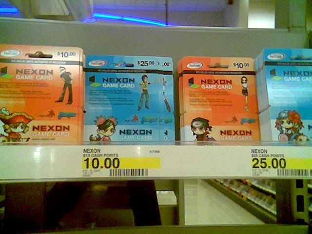
Clever – Yes because they noticed that many players were children and are unable to pay with paypal or credit cards, so they are selling NX cards with codes on the back to retrieve the game money. Now kids can have access to Nexon game money and it maximizes their profits

Ludic – The game is very easy to understand, there is no need to read a manual because there is a stage designed for new players that goes through every step of playing. However, there are online faq’s and manuals in case the user wants to read it.

Pleasurable – The game began in Korea and branched out to Japan, China, Malaysia, North America, and so on. It is very successful and pleasurable.

Because this game is free to play, they include a lot of online product to enhance the experience. Examples are different hair, eyes, clothes, and many things to customize your characters. Each thing may cost from $2-4 and the user feels that it does not cost a lot of money, they will continue to buy more because of the small $2 price, but it adds up. Instead of charging money for people to play, they attract more ‘potential customers’ by letting them play for free. There are millions and millions of people playing world wide, and they continue to make more money from the games they design.


Highly customizable characters


These are the NX cards kids can buy from Shoppers Drug Mart for game money


The Hydraulic Table

Devin Wilson


3. This hydraulic table design initially attracted my attention because of how simple and easy the design is to use and how this design could be useful for absolutely everyone. Everyone uses tables, but not everyone uses new electronics and technology. This design applies to a massive audience. The design is cost effective and automatic allowing the user to use the design with no physical labor making the design unnoticeable, which is ideal in my opinion. The design’s “smart” system automatically levels the table perfectly so that there is no slope on its surface. 


5. The element from the design process that I find most intriguing is the actual designing of the product. I am much better at working with visual aesthetics than mechanics and technology. I find the most interest and feel I am much better at designing an aesthetic appropriate to the designs use, which looks good and compliments its functions


TRUSTWORTHY: This is a trustworthy product because it is a simple design where not much can go wrong. The less there is to a design with a simple use such as a table, the less can go wrong.

APPROPRIATE: This design is definitely appropriate. Outdoor tables (restaurant, patio) with an uneven surface to deal with could be considered a common predicament. Although I believe this is the designs biggest concern. Does this design solve a large enough problem?

SMART: This design is very intelligently designed. I definitely believe the way this table performs should be considered a smart but simple design.

RESPONSIVE: This design requires no resistance of any kind making it responsive in every meaning of the word.

CLEVER: I do believe that this is a clever design for being the solution for a small but common problem. Because of how simple and inexpensive the design is, why wouldn’t every table have this unique ability? There’s nothing to lose.

LUCID: The products process requires simply sitting at the table. Its use is obvious and straightforward requiring hardly and though at all.

PLEASURABLE: I think it is a product of very subtle pleasure. 


Source:  HYPERLINK "http://youtube.com/watch?v=dQC9swFvUnE&feature=related" http://youtube.com/watch?v=dQC9swFvUnE&feature=related


The Hydraulic Table

Devin Wilson


3. This hydraulic table design initially attracted my attention because of how simple and easy the design is to use and how this design could be useful for absolutely everyone. Everyone uses tables, but not everyone uses new electronics and technology. This design applies to a massive audience. The design is cost effective and automatic allowing the user to use the design with no physical labor making the design unnoticeable, which is ideal in my opinion. The design’s “smart” system automatically levels the table perfectly so that there is no slope on its surface. 


5. The element from the design process that I find most intriguing is the actual designing of the product. I am much better at working with visual aesthetics than mechanics and technology. I find the most interest and feel I am much better at designing an aesthetic appropriate to the designs use, which looks good and compliments its functions


TRUSTWORTHY: This is a trustworthy product because it is a simple design where not much can go wrong. The less there is to a design with a simple use such as a table, the less can go wrong.

APPROPRIATE: This design is definitely appropriate. Outdoor tables (restaurant, patio) with an uneven surface to deal with could be considered a common predicament. Although I believe this is the designs biggest concern. Does this design solve a large enough problem?

SMART: This design is very intelligently designed. I definitely believe the way this table performs should be considered a smart but simple design.

RESPONSIVE: This design requires no resistance of any kind making it responsive in every meaning of the word.

CLEVER: I do believe that this is a clever design for being the solution for a small but common problem. Because of how simple and inexpensive the design is, why wouldn’t every table have this unique ability? There’s nothing to lose.

LUCID: The products process requires simply sitting at the table. Its use is obvious and straightforward requiring hardly and though at all.

PLEASURABLE: I think it is a product of very subtle pleasure. 


Source:  HYPERLINK "http://youtube.com/watch?v=dQC9swFvUnE&feature=related" http://youtube.com/watch?v=dQC9swFvUnE&feature=related

Tuesday, March 4, 2008

The Paper Space Shuttle


When I first heard of this idea of building a space shuttle out of paper I thought that it was a crazy idea that will probably kill the people in it if there were any and that the country responsible for this idea was probably Japan. Luckily, after looking further into it these space shuttles, I found out that they won't be carrying any passengers, and yes it was the Japanese that came up with the idea. The individual that proposed the concept goes by the name of Shinichi Suzuki, a professor at the University of Tokyo. The reason why I chose this design was not only cause of self interest but also cause that it was a perfect example of science and design working together to push the boundaries of what is possible and what is not. so far through various test these planes can now survive up to 300 degrees Celsius and have resisted wind speeds up to Mach 7, which for those who don't know is 7 times the speed of sound !!! Each shuttle that has been tested is about 8 cm long and weighs about 30g. the ones that will be used will be bigger, about 20 cm. About 100 of them will be released from the spaceship and will have to travel a distance of 300 miles. the paper being used has been treated with a compound that increases its heat resistance.


Trustworthy?

Well for those who haven't heard/read up on this concept before will definitely be sceptical and say that it is not trustworthy after all its made out of paper. But after reading into it id say it is trustworthy to some extent. although it might not be able to carry any life form on it, it can still carry messages, to both unknown life forms in space and those here on earth.


Appropriate?

I'd say it is appropriate i mean it makes sense that they send up an origami space shuttle instead of something like a origami crane. Also the design appeals to all age groups and genders.


Smart?

Its not really smart in the sense that it won't correct human errors but it can prevent us from working harder. If this idea works and these planes survive it opens up a whole new window of possibilities for using light weight and possibly in-expensive materials to build space shuttles and have them survive.


Responsive?

No not really, it's just a paper airplane.


Clever?

No. But the concept is quite clever and as well as the process of building it, now this paper space shuttle can withstand up to 300 degrees Celsius, which is pretty awesome I'd say.


Playful?

Yes definitely. the whole experience is quite exciting and it toys with the endless opportunities that it could open up, so in that sense yes it is playful. Also those that do survive will contain a message in various languages saying return to the Japanese Space Headquarters with an address on it most likely.


Pleasurable?

Yes, yes it is pleasurable both functual and aesthetically.


Sites:


-there's a video on the first site that i cited so go check it out it of them testing the planes looks pretty cool

World of Warcraft


The design I chose was the very popular online game called World of Warcraft. With over 10 million people playing it at all times worldwide, this seemed like the perfect example of a communication device.

Trustworthy - Created by Blizzard, one of the largest names in computer gaming, and backed up by nVidia, one of the largest graphic hardware companies in the world. Definitely something you can trust.

Appropriate - I would say this game is appropriate. It has something for everyone, and is a great way to relax. Some people take it too far in their gameplay time, so it would be nice to see some restrictions applied.

Smart - It is a combination of social interaction, communication skills, computer skills, time and priority management. And within all this, it follows an interesting storyline for all to enjoy.

Responsive - World of Warcraft is for sure a responsive piece of software. Every button on your keyboard has its action, and the many things on the screen have their functions. There is no delay time between giving the command and seeing it happen on the screen.

Clever - It is clever in the sense that it is a brilliant way for Blizzard to make money. This game is a combination of many different pieces that appeal to different people in different ways. These pieces flow one into another making the game very addictive. It is a cleverly designer piece of software that makes many unfortunate people less clever by turning them into drones that start to 'live' in the game.

Ludic - Before one can properly play the game, a person needs to spend some time reading the manual, and once in the game, there are many tips that help with understanding of what to do. Since it is a pay to play game, the target audience is most likely an audience of already gamers, or people who are a little more serious about their computers than others. In other words, people who are experienced enough with computers to understand some common sense commands that they will have to use in the game. As far as the general public goes, It is probably a challenge to understand even the basics, but as far as the people being targeted by the marketing of this game, it is a piece of cake.

Pleasurable - People definitely take pleasure in using this software. Like I mentioned before, there is something for everyone in this game. If it wasnt pleasurable, 10 million players would not spend $15/month on it.

There is one large problem with this product. The problem directly affects the users, and largely benefits those who made the game. about 50% of the players are addicted to the game, they abandon their friends, some drop out of school, some simply spend every ounce of their free time playing. Their argument is that they have new friends and new lives in the game. This is good news for Blizzard, bad news for the many people affected by this.

I myself play this game casually, and it is honestly a challenge to play moderately. Every chance i get to get away from it, I take.

Credits: www.worldofwarcraft.com

Amensty Pushing Issues


These are photos of advertisement space in transit areas throughout Europe. Amnesty international the human rights organization put out a series of activism poster that took on a unique approach to capture the attention of the viewers.

Trustworthy- Yes, Amensty is a registered and respectable organization.

Appropriate- That's arguable. But in order to gain significant reaction and after thought these ads have to be extreme and intrusive. So even though they seem extreme it's for the greater good.

Smart- You know its smart, you didn't think of it. This ad series does the remarkable job of pushing the boundaries in print media and public space art. Its technique gives image impaction.

Responsive- Yes its responsive, the viewer is really engaged with the image because of its realistic nature and its fit with the surroundings. The power of this lets people reflect about the issue displayed.

Clever- Very. Space behind the ads have never been incorporated in the composition.

Lucid- Yeah the message is straight forward if your a intelligent compassionate human being with an awareness of the world and amensty.

Pleasurable- No! That's exactly what I love about it. Part of its brilliance is to make people uncomfortable waiting for that train, and forced them to think of the horrific acts that are committed against people around the a world. Amensty gets an A+!


troypynn


Interaction Design - RottenTomatoes.com


RottenTomatoes.com is a movie-themed website which, among other features, primarily offers comprehensive collections of as many reviews as possible for as many movies as possible. These reviews are compiled and averaged out based on their individual grades (whether stars, letter grades, numbers, etc). Determining the average "freshness" rating of a movie, the hopeful viewer can make an educated decision on whether they want to spend their time and money on the movie. The makers of RT.com say:

"Why should we rely on a single critic who may have a particular taste in film different from ours? Couldn't we organize and collect all of the reviews from a variety of sources (newspaper, online, magazines) and average them into a single score? We could and did.

Over 7 million readers each month use RT globally as a dependable, objective resource for coverage of movies and DVD. With more than 250,000 titles and 850,000 review links in its ever-growing database, RT offers a fun and informative way to discover the critical reaction on movies neatly summarized via the Tomatometer." (from the ABOUT US page)

On top of this main focus, the website now offers just about everything movie-related - news, gossip, celebrity news, trailers, interviews, blogs, rumors, photos, and even an interactive message board where guests and registered users can interact publicly and discuss everything movie-related (and all else).

Trustworthy - The website is certainly trustworthy as its data is compiled by movie with each individual review sourced directly. The fresh/rotten reviews are based on the average ratings per movie of all the compiled reviews.

Appropriate - The website compiles reviews for foreign films, as well as North American ones, and thus provides a valuable service to every culture and country. The website also breaks the limitations of critical reviews through newspapers, TV and magazines - providing those sources and more so the viewer can get the most comprehensive and well-rounded idea of whether or not the film is suited to their own tastes.

Smart - It does all the math so you don't have to average out all the reviews on your own!

Responsive - No problems here, aside from full page advertisements that you are forced to watch unless you click "continue to..." They recently added a very clear link to the site header where you can report a bug in the site by clicking. This is a smart idea to help improve the smoothness of the site and maintaining that each page works well.

Clever - The whole idea behind the website is clever and within the basic idea that carries the website, there are other fun features, including a "cream of the crop" section of reviews for each movie, where they gather together the reviews of the high-profile critics and provide a separate average rating. A Rotten Tomatoes message board also gives readers a chance to interact with one another to discuss movies, critic reviews, Hollywood news and gossip, as well as TV, DVD, and gaming. This elevates the website from a movie review site to an all-encompassing media site.

Ludic and Pleasurable- The fun theme of fresh vs. rotten fruit to rate the movies, combined with a corresponding color scheme, allows readers to get into the spirit of the website easily. When probed enough, the reader can uncover fun hidden gems, such as lists about the worst movies of the year (or all-time), movie and celebrity photos, trailers, critic profiles, and more. Each page offers up unique information and access to an endless supply of it through links to more pages.

One thing that I think would improve the Cream of the Crop reviews idea is to feature streaming videos from shows such Ebert & Roeper or Gene Shalit's reviews. If a deal were struck between TV critics and the website, there are many opportunities for cross-promotion.

Source: www.rottentomatoes.com

-Jonah

Amy Holmes - Z Island


The Z Island is new interactive technology that uses a touch pad to control many functions of the kitchen. This is done by using the menus, which are displayed on the surface of the counter, made by Corian material. There are four different things you can chose from on the menu; MAC, lights, aroma and heater. The MAC menu controls the Mac Mini, which is integrated in the far end of the kitchen island. It allows you to access music, videos, photos and DVDs. The lights menu controls the full-colour LED lighting system and the white spotlight about the Mac display. It also controls full dimming for red, green and blue to mix your own colours and automatic modes for colour cycling. The Aroma menu controls an aroma dispenser for aroma therapy. The heater menu controls a heating panel that heats your plates up to 80C. The island includes two separate units; “Fire”(the cooking area) and “Water” (the washing area).

I was attracted to this design because of its very futuristic qualities and clear functions. At first glance, it is difficult to distinguish exactly what the design is as it looks nothing like an ordinary kitchen until you understand its features. Its sleekness and smoothness would look great in many modern kitchens. I am very interested in new inventions and this being the first of its kind, it grabbed my attention.


TRUSTWORTHY:
This interactive design is trustworthy because it uses a material which is unbreakable and resilient. There is nothing you can do to this design which would change it in any way. It is also linked to MAC, which is a very well known multi million dollar company, which we all use and trust.

APPROPRIATE: I think this design is appropriate. It includes most of the basics one would have in their own kitchen, as well as a few extra things which not many people have but are nice to have while you’re cooking or cleaning, such as music or a TV.

SMART: I think this new invention is smart as it is technologically advanced and is ahead of its time. It does the thinking for the person using it and anticipates what is required.

RESPONSIVE: The actual features of the Z Island respond to the needs of the person using them. For example, the touch pad responds to the touch of a person’s fingers and acts accordingly.

CLEVER: I believe this design is very clever as it is a real space saver and is able to incorporate all the necessities you need in a kitchen all into one small island. Not only does it include the necessities but it is also able to include luxuries as well.

LUCID: The design is very clear and straightforward. Each feature is obvious and does not require much instruction.

PLEASURABLE: I think people would definitely find pleasure in using this product. Cleaning and cooking is not an activity which many people enjoy doing but I think with this very modern and futuristic design people would actually enjoy doing those chores. It actually makes cooking and cleaning a fun thing to do.

Some elements from the design process that intrigue me:
I would want to be the one who designs the plan of what the product should look like by drawing several sketches with different possibilities. I enjoy using different shapes, layouts and materials to change the look of a product which is already available in another form.

SOURCE: http://www.ecopolis.org/z-island-zaha-hadid-mac-lights-aroma-heater

Jennie Zheng - Inspiring Interaction Design


3. The Velib bike rental system in Paris really inspiring me, it is a bike rental system that can allow user to rent the bike for long-term(a week) and short-term(day). Basicly, user rent a bike in one station and can return it at next station, and i think the distacne between each station is about 30 mins bike. When I fisrt knew the bike rental system, I thought it was very useful and green designed. It can work very well in high population density cities, allow citizen, tourist travell fast. From what I saw in the video clip, the bikes are very friendly designed, there are basket and light in front of the bike allow user to put stuff. It fulfills the need of short, long term transport for citizens and tourist in Paris.

4. Trustworthy - friendly designed
- every bike are the same
- provide basket and light

Appropriate - the system is very appropriate to fast living rhythm cities, it can help reduce traffic jam, and also the most important thing is it is green.

Smart - brilliant, very well designed, now it is not only about design, it is about the practice of everyday custom, habit of the modern mass.

Responsive - I haven't get the experience of the bike, but from the second clip, the paying machine works very well and the bike is easy to use, response well.

Clever - mentioned, the design helps get away of contaminate

Pleasurable - I think it is quite pleasurable to riding the bike on street of Paris and enjoy the view, and you can stop very where you want to.

Credists:
http://www.youtube.com/v/obuxx1bEPcM
http://www.youtube.com/v/d40gx_zZUnM

Here are some that I want to share
the ice bar in Dubai
http://www.youtube.com/watch?v=BBRqM2bz9bo
http://www.youtube.com/watch?v=n17YOg_2eD0&feature=related

the Morden Toilet Restaurant in Taiwan
http://youtube.com/watch?v=3sJCKRRmCIQ&feature=related
http://www.youtube.com/watch?v=D883OhLb9SE&feature=related

Jin Weon Park- Inspiring Interaction Design


Jin Weon Park- Inspiring Interaction Design

This eye- catching design has impressive modern simple design. The current trend is toward eliminating complicated functional buttons such as I pod. This paper clip lamp which is common ubiquitous of consumer electronic appliance, is about to enter new age. This futuristic lamp design was inspired by paper clip that lends itself to being picked up and bent; also same tactile was applied to the structure of the lamp. The designers, Ben Collette and David Wykes, were successfully catches my attention while I was researching on the contemporary lamp design, All of the sudden, I went like “Wow”, this is what I want. Their idea of applying common tools into another tool like combination of existing product would look cleaver and simple.

Trustworthy- This lamp can be considered as trustworthy, because just at a glance it is made of steels same tactile used from paper clip. The firmness of both picked up and bent condition shows strong holding and reliable. This pipe-like design would remind solidity of strong pipes. Consumers may feel relief when lifting upward; the tightness of joint is safe, not falling down easily.

Appropriate- It is appropriate in terms of pursuing of futuristic design trend, make it simple and not just mere unsophisticated work but neat and tidy. As if we look around our contemporary design, there are some patterns, such that lasts longer and creates sustainable design. For instance, I-pod, mobile phones are now extremely thin. The basic needs of lamp; lighting for reading, decorating. This functions appropriately when reading in the dark, folding, and mobile use. Since it fulfills all these needs, this can be legitimate fordable lamp, so appropriate to the users and to the design trend.

Smart- Brilliant, awesome, unconventional, these words were burst out of my mouth, when I first saw this. Yes, it is smart idea, which combines the existing model with different product. This was possible due to precise observation, when you lift up paper clip; it forms Z-like shape. So by applying this characteristic into actual lamp, we get new type of collapsible lamp which is smart!

Responsiveness- This part is hard to tell, since it is just a lamp, it does not have time-based response.

Cleaver- As already mentioned above, this product meets all needs of users. Completely collapsible, moveable, new source of light saves energy (LED Light). It is clever not just because it has all these elements but also the idea they derived from ordinary paper clip which is delightful. This design leads long-lasting good feelings for those people who are looking for efficient storage, this flat collapsible lamp can be stored any place like thin empty shelf.

Ludic- This product is not playful; it does not provide any active things. But, if I play with this lamp, I will possibly find another motion while in the observation. So, improve some of defects found in during the observation. I can either bent this in opposite direction, or extend it so that I could approach to better product.

Pleasurable- This design is plausible, since it touches our feeling which is quite familiar to us, it’s paper clip!! When first look at it, we know what shape is this, but not lamp. But it works well functionally, the Z-shape has top light bar, pivotal, and base as well. This simple method of manipulating clip motions can people to face more aesthetically attractive, so forgiving some of inefficient part or mistakes.

From this research, I found design process can be archived from very trifle intrigues. We see paper clips everywhere, but did not realize to transform it into fancy lamp. If I could work during its process, I personally want to get rid of electric wire charge, instead put long-lasting batteries. Solar-batteries would even better, since LED light does not take huge energy to emit a light. Therefore, it becomes completely movable and flat without tangled wires.


Credists:

http://www.behance.net/Gallery/The-paper-Clip-Lamp/57980

Inspiring Interaction Design


I decided to pick this design interaction because I thought it was very interesting! It was cleverly planned and organized. I love how every body follow the planned and properly played it out. Also, the way others reacted towards the frozen people. The original design was from central station in new york (first video). I believe it was actually a school of performing arts students getting together and applying their skills with the world. It was very well done! I love how everybody stayed in character( their frozen position for 5 minutes). Where the second video was a copy of the original but it was taken place in Toronto Eaton centre by the fountain. People were gathered together by a facebook group. There were hundreds of random people getting together to participate. There was no purpose in doing this but except to copy the original one. It was also poorly done. People were not into character nor were they making it less obvious. There were too many people frozen in one place, people did not stay still, they all obviously waited around until it was time to freeze and their choice of a frozen position was also poorly chosen because it did not look natural.

Looking at the original video( first one), apply all 7 of the "good interaction design characteristics". Trustworthy because the audience (people going around and about in central station) were confused and believed that there was something wrong. They did not understand why and started to interact with the frozen people by taking pictures, looking, pondering and pointing. Appropriate to the culture because New york is a very busy place. People are always going from place to place, in their own world, doing their own thing. By freezing on the spot, forces the other people to stop doing what they do, to all focus on this one even. It goes opposite to the culture normal busy life. It is smart because it's unique. Nobody have ever attempt nor dare to do this sort of event in the middle of a busy place. It shows creativity and organization. The responsive of this design are the other peoples reaction. They show interest and curiosity. It is a stammer respond because some people may not be able to notice right away because once again, they're in their own busy world. Shows cleverness because its unique. Ludie because people interact with curiosity by taking pictures. Finally, it is pleasurable because it entertaining. By posting it on youtube, other people all over the world can enjoy this moment. People at the sense are able to witness the 5 minutes or awkward moment.

Monday, March 3, 2008

Chris Tsang- TakeG toy


The designs that I have chosen are Take-G’s toys. The toys are made from a combination of different types of wood and are all handmade by Nakagawa Takeji. I really liked it because the character design are in a style that I really like and enjoy drawing myself. The thing that I like the most is the techniques, skills and the time it takes to make one of these toys.

7 good interaction design

Trustworthy
- Made from wood which is a strong material
- The edges are all smooth and tightly glue/combined together

Appropriate
- It is noticeably Japanese because of the style of character design so it is appropriate to the culture

Smart
- Not much for “Smart”, because it is just a toy.

Responsive
- Because it is a toy, it doesn’t really respond, but it receives

Clever
- The toy is pretty clever in the aspect of uniqueness, because there isn’t really anything out there that is so intricate and detailed that is made by hand.

Ludic
- It is a toy so naturally you can play with the different features that each different toy offers.

Pleasurable
- They look good therefore it seems like a very enjoyable toy even thought they really don’t do anything

Design Process

I would probably want to be on the mechanics, the brainstorming or crafting part of the product. Because they look so amazing that I want to know how each little thing is made and crafted. Also how the idea of the character designs are developed.

Cedit

http://take-g.com/crafts/big.html

Sfera Alarm clock

Sfera alarm clock is an alarm clock that hangs above you. When the alarm sounds the user gently taps it, to puts it on snooze for 10 min then the alarm sounds again. Each time the user taps the alarm clock to set it back to snooze, it rises higher making it harder for the user to reach. Eventually the alarm clock ends up in the ceiling where the user has no choice, but to get up and pull it back down, and to turn the alarm clock off.
I was attracted to this design because of its uniqueness. I think it’s a new approach to design and it has a nice concept. In the Sfera alarm clock, the touch sense allow the user to interact with the product, and when I first saw it I thought it was aesthetically appealing, because its simple and it can act as an art piece to bring style to the interior. And the product is a creative and an effective way to get people out of bed.

Trustworthy- it works like any other alarm

Appropriate- we are living in a society with rich technology and we are constantly looking for new invention and products.

Smart- yes, I think it does what it does to get people out of bed. In my opinion it’s more affective, because the user needs to physically get out of bed to turn off the alarm.

Response- it only has so much function that it shouldn’t have any slow response. It should have a quick response like any alarms clocks that’s out there.

Pleasure- I think its aesthetically pleasing to the eye because it’s so simple, and it brings in new meaning of using an alarm clock because the user is so much more involved.

The process of brainstorming and outlining requirements is interesting because we need to analyze human function, movement and human factors; than we need to brainstorm and incorporate the idea to make a better and more creative alarm that stands out from the rest of the clocks already made.

Source: http://interactionthesis.wordpress.com/2007/01/29/sfera/

Allie Chiu: The Rinpa Eshidan

GARDEN:


1 week of art works:


3) When I first watched this video, I was amaze due to the work they have done. They keep painting the boxes, moving them around, and further erase the painting and do another one. I think they are courageous because they dare to erase the painting and paint from part of it, and create another new painting. If they do not design all the stuff beforehand and just do it, this would be really amazing. I found this interesting because it involves different individuals painting at the same time and to finish the works.

This group is called “The Rinpa Eshidan” which means "to bring people together, while "Eshidan" essentially means "art crew" (quote from website: http://rinpaeshidan.jp/ ).

4) Trustworthy: The activity is considered trustworthy because the use of traditional medium makes people feel much more comfortable. Also the surface they drew on are wood boxes that is another common material people use in life.

-Appropriate: I think this activity is very appropriate in OCAD community, not only because OCAD is an art and design school, but also because this activity reveals that art, illustration and culture are constantly changing.

-Smart: This activity does not involve mechanical tools to help people paint, so I think the smart here would be replace by human brain. It is true and always believed that human are smarter than artificial intelligence. So I think this activity would turn out really good because every individual have different ways to solve problems.

-Responsiveness: This part is basically same as the above “Smart” because during the creating process of this activity, it does not does not involve other mechanical tools such as computer program to paint. Despite the video recorder which record the whole process, the whole activity is done by human hands. Therefore, this is relay on the creators who do response to the work they create and further decide what to paint next.

-Ludic: This activity is no doubt, very playful. The activity allows the creators to experiment with different ideas, creatures, drawing, illustrations, and whatever the creators wants to do with the work. It would be really fun to see how individuals react and work on this activity.

-Pleasurable: Definitely, there will be pleasure when people create this work. It would be fun to see different image everyday because people are constantly working on it.

5) I would love to work on the graphics and illustration part. I think it would be fun to create the image. Also, I would love to create the boxes or other canvas that people are going to work on.

6) Sources:
http://rinpaeshidan.jp/
http://rinpaeshidan.jp/works/garden.html
http://www.youtube.com/watch?v=jtzdxseO-gs&feature=related

Sunday, March 2, 2008

Jan Mazereeuw: The “Sim City 4” video game and its fan websites


okay, so Blogger wouldn't let me post another video for some reason so here's the link to my second video:

http://www.youtube.com/watch?v=gQlA0zHhlEo


3) I’ve always had a fondness for architecture and urban planning, in fact, I was at one point considering taking Environmental Design at OCAD. I’m also a very urban oriented person as I was born, raised and have come to like Toronto and similar metropolitan areas. I’ve always been interested in the concept of Sim City as a city building simulator and two years ago I received "Sim City 4" as a Christmas present. Everything from the concept to the packaging to the graphics attracted and still attracts me to the game. Because the game is designed to work with internet downloads, it made me last year (as nerdy as it may sound) join a fan website called http://www.simtropolis.com where I can communicate with other fans of the game as well as download buildings, check out profiles, city journals and much more.

4) -Trustworthy: The game is considered trustworthy mostly because of how it’s a game that has been well marketed and created by EA Games, a professional, large and well known gaming company. The name “Sim City” is also famous and people tend to put their trust in things they’ve heard about as mentally we think that if we’ve heard about something it must work and be trusted. Large online fan websites work in a similar fashion. As because of their size, people will put their trust in them. Also, these sites tend to have moderators that guarantee the site works properly, that downloads function and will not damage the game or your computer and guarantee safe online chat.

-Appropriate: The game is appropriate to modern cultures in the developed world as because of the Industrial Revolution in the past, we are a very urban dwelled society and are used to city environments. Because of online communities with downloadable material, one can download buildings that match the architectural style of their urban environment. For example, a person living in Paris can download a large array of old French style buildings, while someone living in Dubai can download many ultra modern buildings to match their city. The game also mirrors power distances (three social classes), the collectivism of a city community and has the ability to easily fix mistakes for a culture with a high uncertainty avoidance.

-Smart: This is actually not a simple game and after a few years of playing it I still struggle sometimes during game play. The game will not prevent, but help players to not make mistakes, work harder than necessary or do things they have trouble with. To help beginners there are a number of tutorials that can assist players with everything from getting started to laying out good mass transit systems. The game also has multiple playing levels from easy to medium to hard to keep the game as simple or as challenging according to the player’s understanding and experience with the game. Fan sites also have tutorials and information and well as sections where users can ask questions to advanced players to help their understanding.

-Responsiveness: This is the only section where there tend to be problems. Because computer software tends to always have technical glitches and bugs, the game doesn’t always respond well to commands during game play. Usually, when a key is pressed or the cursor clicks an on-screen button, the game responds right away, but there can be delays lasting over a second that may cause the viewer to think there is a problem. The game also has a tendency to crash or freeze. Those two problems are common discussions on fan sites and there is a demand on EA Games to fix certain bugs.

-Clever: The cleverest feature to the game that creates positive emotions is the organization of on-screen buttons. These buttons are categories that group things up from roads to parks to government services and so on that are needed to properly develop and maintain a city. Also, the fact that the game was created to work with internet downloads allows the player to customize their gaming experience and get more out of the game creating positive emotions.

-Ludic: Well, considering it’s a video game, it’s very playful. The game allows users to experiment with different downloads, options and what ever else the game offers before one starts to seriously play the game. Because of the save options, players can have a little fun with the disaster options, which allows things such as tornados to wipe out their city and experience the sort of excitement one may find in a thriller or action film. If a player wishes to, they may save their city, then destroy it with a disaster, and then simply restart the game without saving the destroyed city so that when the game starts again, they’re back to their original city with no damage to it. The user’s play doesn’t trap them or have serious consequences.

-Pleasurable: A player will receive pleasure from “Sim City 4” in multiple ways. The graphics are aesthetically pleasing as they are realistic and support the simulation aspect of the game. The game also functions fairly well as it has many options to customize and add to he game play with the help of websites which are also pleasurable to the user. However, the only thing that wouldn’t create good emotions would be the responsiveness issues such as freezing and crashing. I know my self the amount of frustration that comes with software problems, especially when data is lost or damaged.

5) Two elements of the design process that I would love to participate in would include the graphics design element. I would love to create the buildings and textures in the game, it would defiantly be the most fun I would think out of the design process. Because of the game’s responsiveness problems, I would want to take part in the troubleshooting part of the game to try and fix the crashing and freezing problems as well as other bugs that negatively affect the game and its users.

6) Sources:
-The image of the "Sim City 4" video game box is from: http://www.ocf.berkeley.edu

-The commercial for "Sim City 4" is from: http://www.youtube.com/watch?v=ZGwrPMm4yFs